It’s true.
Most of your Twitter fans never go to your Twitter page.
Except the first time they follow you.
This is one of the biggest missed opportunities to convert people on the social web, because frankly, most backgrounds (including ours) are just this side of embarrassing.
The beginning of the year is a great time to make sure all of your ducks are in a row. So, here are 5 things you can do to transform your static Twitter background into a high converting one.
1. Share The Good Stuff
Content marketing is about creating content that your customers love, then using that content to build relationships and convert your fans into customers, over time.
Your Twitter Background is simply one more piece of content.
So, what can you share with casual browsers that they’re hungry to know? And shows that you know what you’re talking about?
I like Jon Morrow‘s approach.
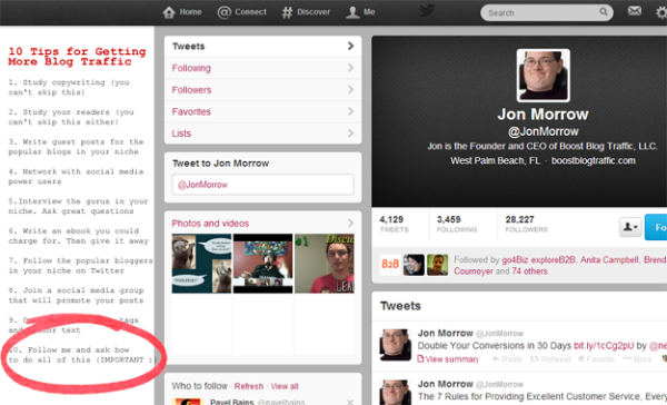
He has a list of “10 Tips for Getting More Blog Traffic.” Check out number 10.
10. Follow me and ask how to do all of this. IMPORTANT.
While his background isn’t flashy, it’s a great example of an educational one that works. Jon’s copy captures people who are interested in blogging. And since that’s what he tweets and writes about, it’s a good way to convert interested browsers into followers, and establish himself as a blogging authority.
This is one of my favourite Twitter background suggestions, as it’s quick to implement and is a simple extension of your content strategy.
2. Show Your Calling Card
I’m surprised at the number of small businesses that don’t have their contact information prominently displayed on Twitter. At the bare minimum, you should have your website in your Twitter bio.
And ideally, your phone number.
Websites with phone numbers convert higher than those without them, yet most of us don’t include them, or at least, not on every page.
While your Twitter Profile isn’t your website, it’s still a page online that represents your brand. And therefore, the phone number rule applies.
This is an easy fix. Simply add it to the end of your bio or include it on the side of your Twitter background.
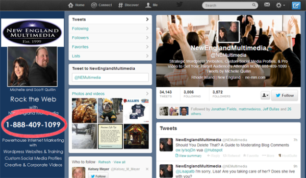
New England Multimedia does a great job of prominently displaying their phone number.
Sure, people may not call you. But feeling like they can call you will go a long way to increasing your trust and credibility online.
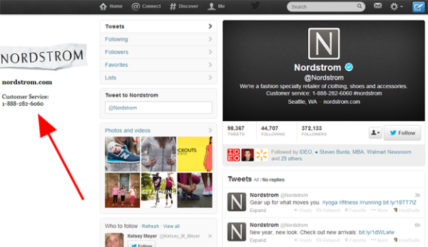
p.s. This works for big retails too, as Nordstrom proudly demonstrates, showing that you’re never too big (or small) to show your digits.
3. Include A Strong Call To Action
What do you want people to do?
Obviously you want them to follow you, so you can continue the relationship.
However, what else do you want them to do? You have 5 seconds to capture someone’s attention and get them to do something.
And no, it shouldn’t be to sign up for your newsletter so they can receive information about the products you want to sell them.
What value can you offer? Do you have a resource page that someone new might find useful? A list of FAQs you’ve answered to help the decision process? An event you think they’ll be interested in?
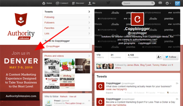
I like what Copyblogger’s doing.
They’re inviting you to join them at their marketing event in Denver, and they showcase a website where you can go and learn more. It would be better if they included a stronger call to action, like “Learn more here” or “Check out our speakers list here.” Regardless, it stands out as a good example of a high converting twitter background.
4. Write A Targeted Twitter Bio
This sounds obvious.
And should have been the first suggestion we made.
Because, as I mentioned in a post last year, I think most of us (including myself) forget what our Twitter bio is for.
It’s not to be funny, capture interest from peers or share what we do.
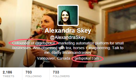
As a small business, the goal is to get followers, and then get those followers to do something. Check out this post on How to Write a Twitter Bio that Converts Customers to make sure your bio (which is the most viewed part of your Twitter Background) starts driving more engaged leads and customers.
5. Use Eye Candy
Yes, this is superficial.
And yes, it’s works.
Your Twitter background is another touch point, what do you want people to see? And remember you for?
While I prefer Jon’s approach with targeted, written content, depending on your business, your customers may prefer a more visual background.
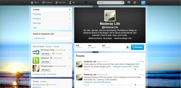
For example, the Maderas Village is an ecofriendly surf hotel in Nicaragua that’s having a lot of success with their visual content strategy. Instead of blogging, they focus exclusively on images, which is a good way to share their passion and experiences with people who love what they do.
Naturally, their Twitter Background reflects that – it’s a surfer strolling into the sunset. It conveys exactly what Maderas is all about, and if you’re their target customer, chances are it will pique your interest.
Madera’s Twitter background photo works because it’s on brand. If Jon used it, it would look out of place.
Why?
Consistency between social profiles is key, especially your business social profiles. Everything from your tone to the overall message and images should be consistent, so that as someone moves through them, they feel related. Therefore, to have a high converting twitter background, make sure it reflects how you share your business everywhere on the social web.
Final Thoughts: Creating A High Converting Twitter Background
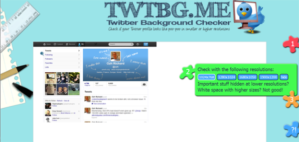
When you’re finished, you can use the free online resource called Twitter Background Checker to see what your Twitter profile looks like for different people on different screens.
It shows a variety of resolutions, so you can confirm that your most important information isn’t hidden by your tweets or the Twitter sidebar.
So, what’s your favourite tip to creating a high converting Twitter background?

