Most companies are happy with an average conversion rate of 3-4%. The marketing department will spend hours debating about the color of buttons and studying heat maps like tea leaves to understand how they can increase their conversions.
When the conversion rate increases from 4% to 5%, there’s a party. — and so there should be! An increase of an additional percentage point can result in thousands of dollars in revenue for company.
But did you ever stop to think that a 5% conversion rate is a 95% failure rate?
Nine times out of ten you’re disappointing your audience. You’re not giving them the right information or providing enough perceived value to convince them to buy.
The key to long term conversion rate growth isn’t special orange buttons, it’s building value through knowledge and trust. Here are a few reasons your customers are nervous about pulling the trigger, and how you can convince them otherwise with the right content.
Improve the Quality and Context of Your Photos
At face value, dull photographs lack the excitement needed to draw customers in. Flat images on a white background fail to tell a story or sell a lifestyle to customers. However, quality images also build trust with the customer by teaching them more about the product that simple descriptions can’t convey.
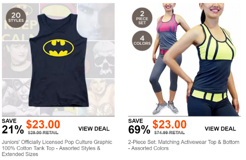
Look at the two product images below from Choxi and compare what each one does right and wrong.
The Batman shirt on the left moved beyond the plain white background, and will draw more eyeballs with the images in the background. However, the fact that there’s no model wearing the shirt, leaves a lot of unanswered questions about the fit.
Is it a tight fitting tank?
Will it end below the waist or right on it?
All of these questions are answered by the photo on the right, where you can see how the tank fits on the model’s body.
While women’s fashion is particularly finicky — what looks great on one woman is unflattering on the next — the importance of context extends well beyond clothing. Home goods and fixtures need context to assure customers they’re not ordering something much smaller or larger than they wanted. The same applies to outdoor equipment, storage containers, car accessories, and tech. The size and shape of the item is crucial in convincing the customer to say yes.
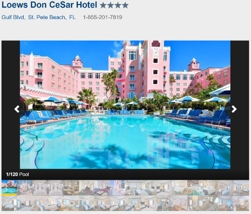
Along with taking photos in a bright light and providing context, opt for multiple shots to showcase the different angles and form of your products. There’s a reason hotels share 20-30 photos with Travelocity — they want to establish trust with customers and convince them to book their next stay there.
It may sound cliche, but a picture says a thousand words, and can sell an experience much easier than a million quality product descriptions can.
Take Advantage of Video Tutorials
We’re living in a Golden Era where marketers have high definition video equipment in their pockets all day and can record screen sharing sessions in the click of a button. There’s no reason to avoid embedded video content on your product pages.
These videos let customers take a trial run of your products and see them in action. From Saas companies filming tutorials to show off their features to fashion retailers filming a model walking around to show how a garment flows.
Check out the video below by Spokal which shows off their social media automation tool. The productions concept is simple: let someone who eats, sleeps, and breathes the software talk about what they made and how much they love it.
Another great example of using people to form a personal connection around a topic is Rand Fishkin’s Whiteboard Fridays. In weekly 10-20 minute videos, Rand goes over SEO concepts ranging from the basics of meta tags and descriptions to choosing a domain name — which you can see below.
His inviting personality makes the concept of search engine optimization less intimidating and the conversational tone breaks down complex ideas into easy to understand thoughts. In all likelihood, your customers aren’t going to be experts in the field — that’s why they’re turning to you — and video content is a great way to show your experience and personality.
Furthermore, video content lets customers put a face to your name. Psychologists have found that faces trigger emotions and build connections with the person in a way that other images do not.
This is great news for companies that sell B2B products or items that aren’t as exciting or fancy as dresses and jewelry. Utilizing video content allows you to elicit emotions from your audience in an otherwise dry industry.
Want Help With Your Content Marketing?
 The 3 Pillars Guide Will Get You Focused on The Right Things - At The Right Time. Enter your email address to get it now
Add Comparative Elements to Your Reviews
Even the best photos won’t paint a complete picture of your products to the audience. On the fashion side, customers tend to be skeptical of models who look good in everything and might be photoshopped. In the tech industry, the size and shape of an item rarely matters as much as the performance. This is where customer reviews come in.
Your customer review is as good as word of mouth marketing. Almost 90% of customers read reviews and 85% of customers say they read up to ten reviews before making a decision. Today’s customer knows that every product has its bad qualities in the same way that one unhappy customer doesn’t reflect the feelings of the whole group. As such, customers read reviews to paint a complete picture of the perks and drawbacks of an item.
To paint this picture, it helps to provide comparisons of the item to similar products like it, and even those in the industry. Is your technology faster than your competitors? Is this home appliance more or less energy efficient than your other models?
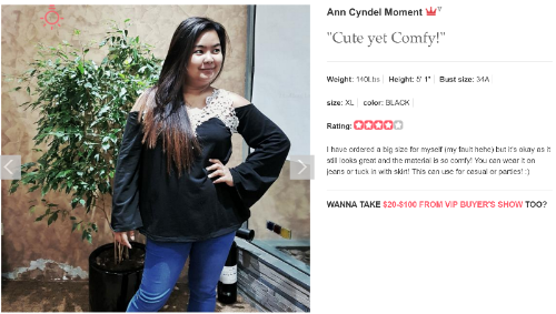
SammyDress is one of the best examples of pulling customer reviews and offering comparisons to shoppers. They provide incentives (like points for discounts) for customers to share their photos and upload their information on it.
Not only can you see how this photo looks on a non-model human being, you can also get her measurements and compare them to yours. From this review in particular, you can see that even if you order the wrong size, it still looks good.
Other stores like JCPenney and Macy’s let customers rate clothes that run small or large for their typical sizes to warn other customers. This makes shoppers more informed and likely to buy, while saving the company money by lowering the average return rate of merchandise.
Embed Social Media and Review Site APIs
Your new customers aren’t just looking at your website before they buy. Even if you have hundreds of customer reviews, they want to know what your company is like, how your customer service team behaves, and how reliable your shipping methods are. There’s nothing worse than ordering an item that arrives broken — three weeks late.
In fact, 81 percent of shopper conduct online research before they buy, and 61 percent start with search engines. By including APIs to other sites like Facebook, Twitter, and Yelp, customers can conduct this research without straying too far from your homepage.
First, these APIs open the door for more photos of your products from Instagram and Facebook. By stepping outside the traditional professional photos, you can prove that your products and services are as high quality as they appear. Everyone knows hotel photos are shot in their best light, but customers still don’t want run down beds and dirty carpet when they arrive. These social feeds prove that your products live up to the hype.
Next, they also provide more insight into how your company handles problems — and what those problems are — than the reviews on your product page. Your customers use Facebook and Twitter to ask about orders or report problems, and new customers expect to see you offering solutions. Review sites like Yelp allow customers to share their stories in-depth, including how the company solved their problems.
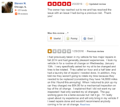
Look at the below review for an auto repair shop. Immediately, customers know going in there’s a chance the technicians will run an additional check and should clarify whether they’re okay with it when they visit. They can also see that the owner is actively engaged in the customer experience outside of the products and services they offer and works to fix customer problems after the transaction is complete.
These interactions are why this particular repair shop is one of the highest rated in the area.
The actual product is only one part of the purchase process that customers consider. In this online world, they’re committing to the company’s shipping, tracking, and return policies few a week or two until the transaction is complete.
Virtual Fits Substitute the Dressing Room Experience
Recent studies have found that 40% of the population learns visually, while 10% are auditory learners and the rest are kinaesthetic learners — or they learn by doing. Some companies are creating 360 degree visuals of their products which engage customers by letting them click and control how they see the product. This taps into the world of kinaesthetics in the highly visual world of the Internet.
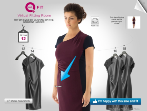
One great example of this is QVC’s virtual fitting room. There are not QVC stores and customers have to rely on what they see on TV and the website to decide if the garments will fit them. To combat this problem, the company enlisted Fits.me to create a virtual fitting room. This tool lets users upload this measurements and provides instructions on measuring your bust or hips, and then provides advice on how the garment will fit and where it will be tight.
You can also “try on” different sizes to see what works best. This creates a fitting room environment in a digital world.
Your product descriptions work to provide all of the answers customers can automatically answer when they’re in the store. These virtual dressing rooms are trying to further blur the lines between digital and physical experience.
Everyone Learns In Different Ways
Your customers are going to learn about your product in different ways. Some will be moved by your images while others will appreciate the specifications listed in your product descriptions.
This means when clients ask us which elements they should have on the product page, we often say “all of them.”
As long as your website doesn’t get too cluttered, feel free to include photographs, reviews, video, social media streams, and ratings all on your product pages. Amazon manages to have almost all of these and rarely has a cluttered interface. This is especially important when you’re selling big ticket items and products with a lot of risks associated.
The more knowledgeable your customers feel about your products, the more likely they are to trust you — and their judgment — to buy.
P.S. This also gives you an opportunity to break out the heatmaps and obsess over what content works and doesn’t from the customer’s viewpoint, thus completing the circle of conversion rate optimization.
