When marketers want to make a big impact on their marketing, they often focus on going after a big project. You know the kind: a big email campaign, or a huge website redesigns or a big social media project!
But while big projects can have big payoffs (as long as they’re executed smartly), it’s undeniable that they can also be very time consuming. And we all know that you’re already struggling enough keeping up with these 3 minute meetings, scarfing lunches down while listening to podcast proofs, before rushing off to your next meeting.
But not to worry – there are ways to make a big impact without having to run a big project. Instead, small tweaks can often make a world of difference. Especially when they’re on your call-to-actions (CTAs).
The 6 Most Common Types Of CTA
There are 6 types of CTAs that you’ll see most frequently, and they are: Sidebar, in-line CTA, scroll box, exit overlay, smartbar and popup.
Let’s take a look at the various CTAs that you can employ on your website.
1. Sidebar
Some CTAs are great for blog posts, some for certain offers, and others for broader concerns. The sidebar CTA is a great choice for CTAs that are focused on broader, business-wide goals because they aren’t super connected to a particular blog post.
They’re usually positioned on, well, the sidebar of your website.
2. In-line CTAs
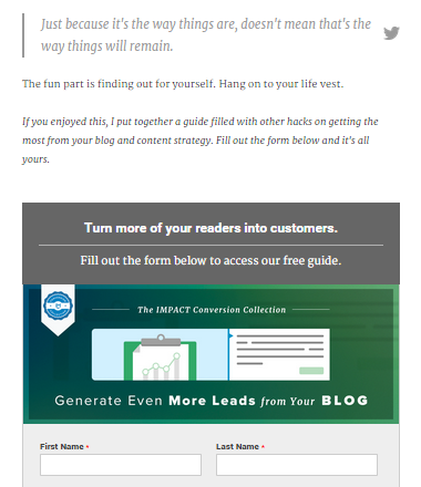
Not all CTAs stand out and apart from your content. The in-line CTA can be placed within your content.
In-line CTAs don’t necessarily follow the same “button-style” CTA that other CTAs do. For example, you could read this blog post to find out more information on the power of effective in-line CTAs. (See what I did there?? That’s an example of an in-line CTA that isn’t a button).
But, if you’re a button fan, that’s fine too! Here’s an example on how Impactbnd does it:
3. Exit overlay
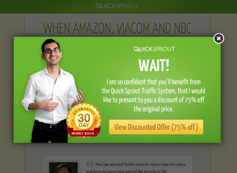
An exit overlay, unlike a traditional pop-up, is a modal or lightbox overlay that is activated in the same window the user was already browsing in. This marketing tool is designed to convert website visitors into leads as they’re leaving a website.
Generally, exit overlays grey out the rest of the site in order to focus the user’s attention on the overlay’s offer.
Here’s an example of an exit overlay via QuickSprout:
4. Smartbar
A smartbar is a bar that appears at the top of a website with your chosen CTA. Smartbar’s generally scroll with the screen so they always remain at the top of the user’s window, but there are options that allow for the user to exit out of the smartbar.
Here’s an example of a smart bar via RobbieRichards.com:
5. Pop Ups
While pop-ups get a pretty raw deal when it comes to users, the simple fact is that they’re still effective. And, when they’re used properly and sparingly, they don’t have to be so annoying for your users.
A few things to note when using pop-ups:
- A pop-up should have one single clear intent.
- Pop-ups should be easy to exit.
- Pop-ups should be timed accordingly. Bombarding people with pop-ups as soon as they step on to your site is just rude.
- Look at your analytics to discover how long people stay on a specific web page for, and then schedule your pop-up to show a few minutes into that time period. This means that people will read your content and start to trust you before you ask them for something.
6. Scroll box
As you scroll down on many sites, you may notice that a CTA slides into the bottom of the screen.
This is a non-intrusive way that encourages your blog readers to convert on your blog posts. Scroll boxes can be extremely effective – since we introduced the scrollbox to Spokal we’ve captured 358% more leads across all accounts than we have with the sidebar widget.
The 4 Elements Of A Great CTA
- Copy
- Colors
- Format
- Test
1. Writing Copy That Converts
Use actionable language.
For effective copy on CTAs, use action-oriented, second-person verbs. This empowers your readers, and encourages them to click your CTA. Language such as “learn, download, discover, find, unearth” are all much more effective than “be smarter, get this paper”. This also has the additional advantage of creating more concise copy.
Align CTA copy with landing page copy.
Always ensure that the language you use on your CTA reflects the language you use on the landing page that the CTA will take your user to. This means that if you call your ebook a “downloadable business pack” on your landing page, then your CTA should also be called this.
Include a clear value proposition.
Why should your reader download your ebook, or whitepaper, or guide? You need to be clear about what value you’re CTA has. People generally won’t part with their email unless they can get something in return.
This means that you should describe what your product actually is, and how it will help them.
Play up its time-sensitivity.
People are busy online, so they might think that they’ll sign up later, or that they just want to get in, get the information, and then get out again as quickly as possible. Typing in their email address may seem too time-consuming and not something that they necessarily have to do now.
One way to encourage your readers to sign up is to create a sense of urgency, and one way to do this is to add words like “today” and “now” to your CTA buttons.
2. Designing Your CTA
Use Colors To Entice
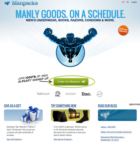
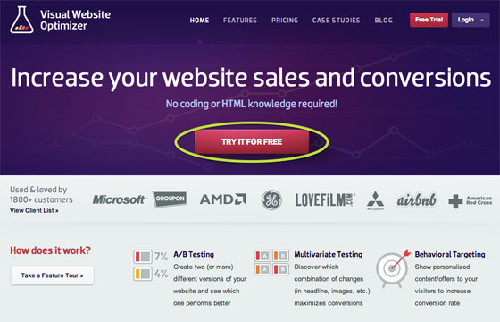
Design is a huge factor in how effective your CTA will be. A CTA that doesn’t stand out from the rest of your website will get very little attention, so while it’s advisable to stay with the same style of your website (similar fonts, colors in your style guide etc.), it’s also important that readers actually notice it.
For example, look how Manpacks green CTA stands out from the rest of their colors:
Make the button look clickable.
You’ll have noticed that most things online that can be clicked, look like they can be clicked. This is because shading or contouring makes the button look like, well, a real-life button. So if you want your CTAs to be clicked, it makes sense to make it look like something that people know to be clickable, right?
3. Format Your CTA
Place your CTA prominently on your website.
Once you’ve designed your CTA and written its copy, it’s time to start putting it to work on your website. Placing your CTA above the fold will gain more click and conversions, while placing it below the fold will gain you higher quality leads, so it all depends on what your goals are with your CTA.
Wherever you choose to place your CTA, ensure that it’s in a prominent position on your website – don’t hide it away.
Personalize CTAs for different segments of your audience.
Of course, you should A/B test your CTAs (we’ll get into that a bit more later) but you can also tailor your CTAs so that they only show up to a select part of your audience. For example, you might want to show one CTA to your leads and another to visitors
Add alt text.
The web is becoming a very visual place, but there are browsers that may not support your images, or visually impaired users that rely on textual content in order for them to use the web. In order to ensure that all your users get the same great experience, it’s important to add alt tags to your CTAs (as you should with all your visual content).
4. Testing Your CTAs
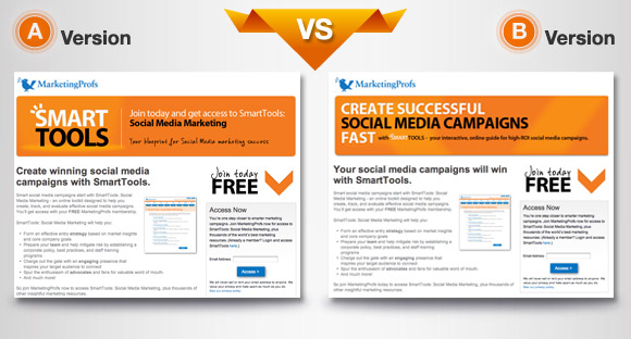
A/B Test Various CTAs To Find The Best Performer.
Sure, following these rules will optimize your CTAs, but A/B testing them is the only way that you can know for sure that your CTA is performing at its best.
How To Create Compelling CTAs With Canva
Creating CTAs is all about creating visuals, so you need to find the right graphic design platform for you.
If you’re a photoshop pro, then lucky you! Go ahead and skip this part, you already have the skills to create great CTAs.
For those of us who don’t know what “blending” even really means, there are other tools that are extremely effective in creating CTAs. My absolute favorite? Canva.
Canva is easy to use, provides templates to help you create designs, allows for a huge variety of projects, has a large database of free (and paid) images, and with their design school, anyone can learn how to pass for a graphic designer with a little practice.
Step 1: Choose Your Size
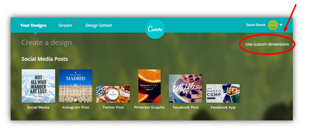
The dimensions of your CTA will all depend on what kind of CTA you’ve decided will work best for you. While Canva has a bunch of ready-made dimensions, there is also a “use custom dimensions” tool:
This allows for you to create graphics in any dimension of your choosing, based on inches, millimeters or pixels.
Step 2: Get Inspired
What kinds of CTAs have convinced you to take their intended action? Look through your inbox at what newsletter you’ve signed up for, and then go to that website to see what the CTA looks like.
Step 3: Copy The Layout Of Your Inspiration
Great, you’ve found a CTA that impresses you. Now, copy it.
No, I’m not saying make a direct replica of it. Instead,just use the layout of an existing CTA as the basis of your CTA’s layout.
Here’s the thing: You’re not a graphic designer, but the chances are many of these CTAs have been created by actual graphic designers (or at least people with more experience with graphic design than you), so mimicking them/being inspired by them will help you create something that looks good, and performs well!
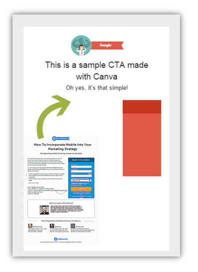
I like to print screen the CTAs that catch my eye and save them as a picture.
I then upload that picture to Canva and insert them into the graphic I’m creating. This helps me match up the layout as I go, as you can see below:
The original CTA picture can be moved, deleted and re-added at any point in your design creation.
Step 4: Choose A Color Scheme
Usually, your website will be what decides your color scheme for you. Like we said, you want your CTA to stand out, but also work with the flow of the rest of your website’s aesthetic.
I know, it sounds hard. But trust me, you just need the right tools.
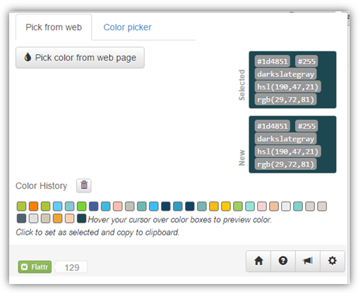
First, download an eyedropper tool, like Instant Eyedropper or, my new favorite, EyeDropper.
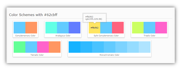
Use your eyedropper tool to select the shade on your website you want your CTA to match, and then copy it into ColorHexa.
ColorHexa analyses the color code and gives you complimentary and contrasting colors (among other things).
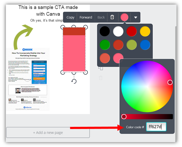
Copy the codes of the contrasting/complementary/tetradic etc. colors of your choosing, and simply paste it in Canva.
Step 5: Write The Copy
Once the color scheme and layout is all set, then it’s up to you to create compelling, actionable copy. Remember: Use action words, keep it short and sweet, highlight only your best features and call attention to how you can help people.
Then you’ll probably spend some time tweaking fonts, position of images etc. Be picky, make yourself look at the smallest details, and spend some time getting it just right.
Step 6: Add Your CTA To Your Website!
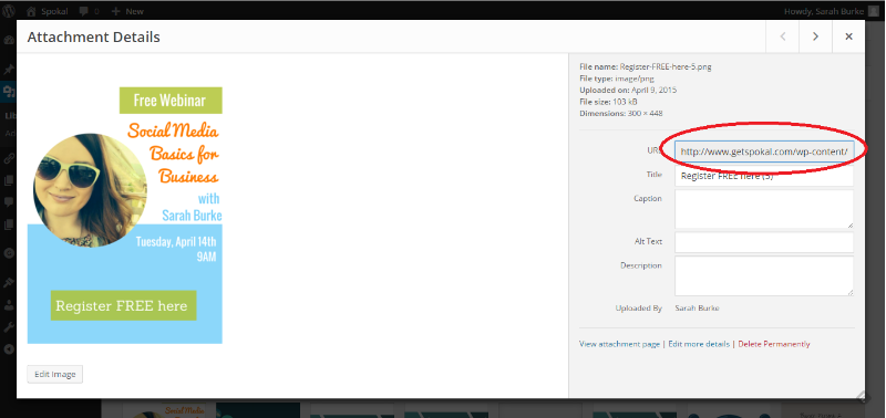
If you’re on WordPress, you simply add your graphic to your media library, and then copy the URL for the graphic to your chosen CTA destination.
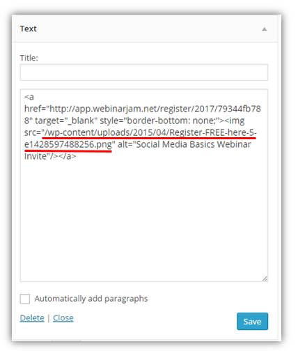
This particular CTA is on our sidebar, so I simply go to Appearance >> Widget >> Primary Sidebar >> Your Chosen Placement and add the URL into my embedded code.
And you’re all set to go!
Strategies For Getting Readers To Opt-In
There are 3 main tactics that you can use to get your visitors to opt-in to your CTAs: Ask, trick and force.
Ask
The politest of the bunch, asking people to sign up is always a favorite amongst website visitors. By offering updates, news, discounts, promos and freebies for an email, customers don’t feel resentful or annoyed because the decision has been placed solely in their hands. This is how you create a relationship with your readers that is based on trust and mutual respect.
Trick
If you trick customers into giving over their information, you run the risk of ruffling a few feathers. People like to feel like the business that they’re dealing with is transparent and honest.
Visitors can be tricked into opting-in through comments section, polls, quizzes etc. When the content is good enough, users usually don’t mind – or even notice – that they’ve been tricked, but if the content is sub-par then you’ll notice very few people will turn into loyal customers.
Force
Content that expires, or is for members only, is the most forcible way you can get customers to opt-in. This tactic is only effective if you’ve already proven to your visitors that you are trustworthy and offer a lot of value.
Likewise, contests that force users to enter their information in order to gain opt-ins can be effective if the prize is deemed worthy enough of the effort.
Conclusion
If you don’t have much time, but you want to make a difference with regards conversions on your website, your CTA is a prime opportunity for you to do so. So use actionable words, make your CTA pop with some color, create buttons that are just too clickable to resist, and above all: run A/B tests so you know what your best performers are.
Want help with your content marketing?
 That's what we're here for. Sign up to receive our monthly newsletters, along with a free small business pack!
Spokal’s 10 Part Content Marketing Series
- Introduction to Spokal’s 3 Pillars of Inbound Marketing (Content Marketing Series Part 1 of 10)
- Content Marketing: The Lifeline of Your Online Business (Content Marketing Series Part 2 of 10)
- The 8 Key Factors in Creating Great Content (Content Marketing Series Part 3 of 10)
- Website Usability and On-Page SEO (Content Marketing Series Part 4 of 10)
- A Guide To Off-Page SEO (Content Marketing Series Part 5 of 10)
- The Ins & Outs Of Social Media Marketing (Content Marketing Series Part 6 of 10)
- A Beginner’s Guide To Paid Online Advertising (Content Marketing Series Part 7 of 10)
- How to Get them from Browsing to Buying: Lead Nurturing (Content Marketing Part 8 of 10)
- The Art of Creating Compelling CTAs (Content Marketing Series Part 9 of 10)
- The Beginner’s Guide To Email Marketing (Content Marketing Series Part 10 of 10)

