I’m sure you’ve heard the “fact” that people process images 60,000 times faster than they do text, right? The quote is supposed to highlight the important role images play in human understanding.
But on further research, the fact just doesn’t hold up.
In fact, no one knows where it came from! Although, A Difference does a remarkable job at researching it to as close as humanly possible.
But that’s not to say images aren’t important. In a study by MIT it was concluded that the brain can process an image in 13 milliseconds! Which is rather remarkable when you consider that, with there being 1,000 milliseconds in a second, that would mean that we can process about 76 images per second.
That’s kind of mind boggling, am I right? Even if the 60,000 times faster than text fact isn’t quite accurate, one thing is for sure: we process images really fast.
No wonder 65% of people are said to be visual learners.
But do you know what’s even crazier?
That, as business owners and marketers, we’re only starting to really tap into the power of visual content marketing now! Only in the past few years have infographics, Slideshares, video marketing and high-quality graphics become in any way a priority for business owners.
And it’s still far from a high priority in many businesses.
Of course, most businesses that utilize inbound marketing in one form another, be in emails or blogs, have started using images (hopefully copyrighted correctly) and while this is great, I’m afraid to tell you that it’s just not enough anymore. Why? Because we’re starting to ignore these images. They’re repetitive. They’re all the same Flickr-found images. They don’t stand out from the crowd. If things continue as they are, it won’t be long before stock images and over-used Flickr images will join the likes of banner-ads in a black abyss where they’re overlooked by consumers everywhere.
Bleak, huh?
Of course, Flickr and stock images are still fine, but like most things in the world, we have to learn to use them in moderation. A business that uses only these image sources aren’t tapping into the wealth of potential leads that are waiting to be attracted by a unique and interesting graphic.
It’s clear that we need to start to reengaging this very visual world with something new, and there’s no better way to guarantee that something will be unique then by creating it yourself. And here’s the real kicker: while you’ve been off complaining that you can’t afford a graphic designer, and that you wouldn’t know where to start with Photoshop, other content marketers have figured out how they can create their own DIY visuals that get them noticed.
Anyone can create high-quality graphics. Sure, they might not be professional graphic designer quality (unless, of course, you are a graphic designer!) but there are so many tools that allow you to fake it until you make it!
I’m going to walk you through what tools that you can use to create some fantastic high-quality images.
How to Make DIY Visuals: Working with Color Palettes
Firstly, let’s talk about colors. Some people have a natural eye for color. I’m lucky to say that I do. However, as evidenced by my dad’s newly painted electric lime green kitchen, we’re not all so lucky.
Design Seeds
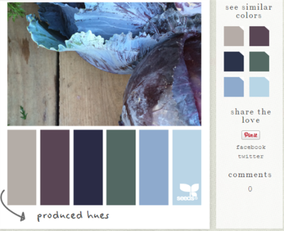
But fear not! The internet has the solution, and it’s called Design Seeds. I actually stumbled across Design Seeds while decorating my living room, but there is an option for “marketing hues” too which I’ve found super useful on days where my eye for design isn’t quite cooperating.
You get a sample of colors that compliment each other well, and that attract the eye. If you hover over the “similar colors” at the side of the image, you can get the color code and use this code when creating you high-quality images.
Instant Eyedropper
Another super useful tool that I’ve come across while trying to create interesting and unique graphics for Spokal is Instant Eyedropper.
One difficulty that I came across time and time again was when I had an image of my own that I wanted to incorporate into a graphic. What kept happening is that I would have to play around with color wheels until I found a color that would look relatively like one of the colors in my image, or to match up with the background of the image itself. But it was always just a little bit off, and it was also time consuming.
That’s when I found Instant Eyedropper and tada! It’s a super easy app that you can download to your computer. Once it’s downloaded, you simply go to your icon tray, click and hold the app and drag it to the color that you want to copy. Let go of the mouse once you’re hovering over the desired color, and then let go. Go to your notepad/Word doc and copy (ctrl + v) and you’ll miraculously see the color code you need appear! You can use this in some of the graphic design platforms that I’ll mention in just a few moments (as well as in Photoshop, if you’re clued into that!)
Color Hexa
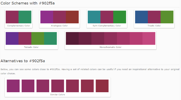
Another issue that I’ve encountered numerous times regarding color palette is understanding what colors are complimentary/contrast to the ones I already have in my graphic. Using my Instant Eyedropper tool, I often select a color from my graphic that I’d like to compliment or contrast with and copy it into ColorHexa. Color Hexa analyses the color code and gives you complimentary and complimentary colors (among other things!) It’s super easy to use and saves you tons of time trying to figure out the exact right shade for your graphics.
I’ve used it countless times to come up with an image for the text of my visual that would work well with its background.
Choosing the Right Fonts
Another hugely important aspect to creating unique and interesting graphics is the font you choose. With most of the platforms I’ll mention, there is a pre-existing set of fonts that you can choose from. Remember to consider the feel of your brand (casual? Professional? Formal? Relaxed?), the tone of the post, and the colors that you intend to use. You’ll likely change the fonts a few times as your design comes to life.
I know that I do anyways.
For those of you creating a Slideshare or using PowerPoint, try and stray from the norm by downloading fonts from the likes of Da Font and Font Space. Adding unique fonts to your graphics will help them stand out from the crowd, increasing their chances of being noticed and shared.
Once you’ve gotten down how to create a color palette, and where to find fonts, the next thing to do is find a graphic design platform that you’re comfortable using. Here’s a few of my favorites, but there are tons more out there too!
How to Make DIY Visuals: The Design Platforms
Canva
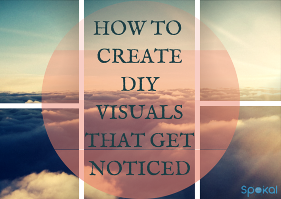
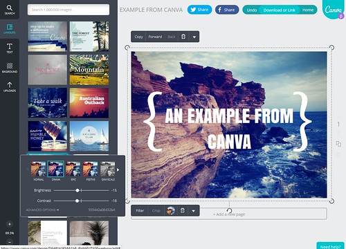
I’m going to cut to the chase and start with my favorite platform to design my own DIY visuals – Canva. The main image of this post was created with it, in fact!
The great thing about Canva is, the more you use it, the better you get. Especially now that they have a photo stream of other user images that you can gleam some inspiration from, and a Design School that I highly recommend too. From learning about text alignment, how to brand your images, to using grids creatively, taking a few minutes here and there to look through the posts will drastically improve your DIY visuals and make you pass for a pro in no time!
PicMonkey
I don’t use PicMonkey as much as I should. Every time I do use it I create DIY visuals that are incredibly unique and interesting, mostly because their filters, layouts and frames are so much more unusual than most of what you’d see on Canva, like so:
PicMonkey is also fantastic for creating banners and buttons for your social media accounts.
PowerPoint
I know that PowerPoint’s purpose isn’t exactly for creating images, but it does a really great job of it, so I’m putting it in here! Plus, how else would you create a Slideshare?
For instructions on creating a simple Slideshare design, check out this post.
How to Make DIY Visuals: Infographics
Easelly
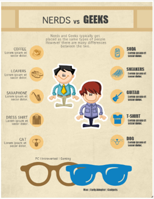
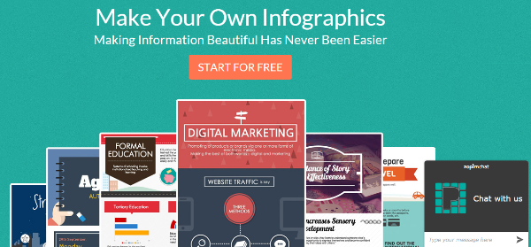
Easelly is another fantastic platform for creating infographics. I love their templates, which are easy to edit to create your very own masterpiece, but also saves you a ton of time coming up with a design idea.
The only problem is that they have a very limited amount of images for you to use, so be sure to head over to Free Digital Photos to some nice images.
Piktochart
Piktocharts free themes are a little more limited and I feel like you have to put a lot more work into your infographics before you get something really decent from it. However, if you’re willing to pay, their pro themes are absolutely beautiful!
Plus, they have over 4,000 graphics that are free to all users – Big bonus for those of you who don’t like to run around the net too much!
Infogram
I adore the ease of use with Infogram, but unfortunately you have to upgrade to their paid plan to download your infographic. Don’t make the same mistake I did and create an entire Infographic before realizing that this was the case – Such a waste of time!
How to Make DIY Visuals: Social Media Visuals
InstaQuote
If you’re active on Instagram, you’ll know that the entire platform relies solely on visuals. To create something truly unique on your Instagram, why not download InstaQuote to your phone so that you can easily create DIY visuals by adding text to your images? It’s great for adding quotes to an image or to advertising special offers/discounts that are available etc.
Shareasimage
A picture speaks a thousand words, so instead of writing the same old Twitter post, create an image with Share As Image. It’s really easy to use (seriously, anyone could do it!) and it adds your business logo in there too once you’ve uploaded it!
Conclusion
One of the key components when creating interesting DIY visuals is to keep it very simple. Lucky for us, this means that with just a bit of practice, and the right tools, you’ll be able to compete with the best business blog graphics out there. The important thing is to remember that as long as your visuals are unique, interesting and eye-catching, you’re going in the right direction.
How do you create beautiful DIY visuals that help you stand out from the crowd? Please share any tips and tricks that you may have!
Want more?
 That's what we're here for! Spokal aims to help small businesses with their inbound marketing, and we do our best by sending your actionable tips and tricks, templates and guides to help you get creating better content and other great material!
