This blog post has been re-purposed into a Slideshare. Just scroll on down to the bottom of the page if you’d prefer to get the information through a visual medium!
You’ve heard time and time again that you should be mixing up your content.
But it’s hard to get out of your blog post funk sometimes.
A great way to make the step is with a Slideshare.
Why?
Because creating a Slideshare is a lot like writing a blog post.
Both blog posts and Slideshares work very similarly: They both aim to tell a story, while adding value to their viewers lives.
The only difference is that Slideshare presentations rely more heavily on visuals to effectively communicate these stories and use the written word to aid in understanding, while blog posts rely more heavily on the written word to communicate its message clearly, and use images to aid in understanding.
Because of this, Slideshares require you to work with visuals as your main medium rather than text.
If you don’t have a good eye for visuals, then you may be balking at the idea of creating an entire piece of content created around visuals. But don’t worry – Powerpoint does most of this work for you. You don’t have to be particularly design-inclined to create a decent looking slideshare with Powerpoint.
At first, it can be hard (especially if you’re a bit of a perfectionist) but it’s far from impossible.
You can create a Slideshare from scratch, or you can create it using a blog post that you’ve already published it. Repurposing a blog post into a Slideshare is slightly easier in my opinion, so if you’re not super confident in your powerpoint skills, I’d suggest going down this route for your first time.
Here’s how you can create a professional Slideshare, even if you’re just a beginner!
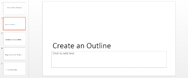
Create An Outline
Just like with a blog post, your Slideshare should have a title and subheadings. In Powerpoint there are different slide styles, which you can find it the “Home” tab under “layout”. For you title page use the “Title Slide” and the “Section Header” slides for you subheadings.
This will help to differentiate your headers from the body of your Slideshare and make the presentation seem like a more cohesive piece.
Of course, you can play around with the design of the section header and title a little later, but the idea is that they’re distinct from one another from the very start.
Choose A Color Scheme
Before we begin, please always remember that all your content should be in keeping with your brand identity. Ask yourself the following questions before choosing colors, fonts and background styles you’ll be using for your Slideshare:
- Is your brand casual or formal?
- Is your brand laid back or energetic?
- Funny or serious?
Answering these questions as you make your decisions will help you create a presentation that reflects your brand’s image.
Now, on to the color scheme.
I know, I know. It’s not fun.
But not to worry!
Powerpoint has a lot of design features that can help you out.
However, I wouldn’t recommend using one of their pre-made themed templates for two reasons.
- Everyone will recognize it immediately (most people are familiar with Powerpoint in some way). Once people recognize it as a theme you just poached from Powerpoint, their trust in your content will fall. Not good.
- They can be quick busy and don’t allow for you own graphics to fit in neatly with them.
To avoid being spotted as an imposter, while also creating a presentation that looks professional, I suggest working off of one of Powerpoint’s plainer designs.
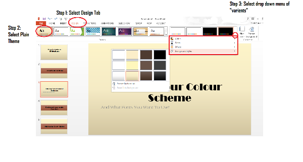
Simply go to the “Design” tab and select one of the plain themes that should appear as the first options on the left.
Once you’ve selected this, go ahead and select the drop arrow for the variants on the right like so:
You can choose from a variety of color schemes here. If you aren’t sure what colors you want to use, I suggest sticking with relatively neutral colors like beige, brown, greys etc.
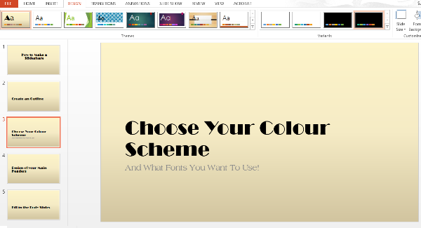
In the same drop down menu you can choose different styles. I like to choose lighter background and gradients because I think it looks clean and professional, but it allows for me to add my own graphics without having to make too many adjustments to the background later on!
Once you choose your colors, don’t forget to also set up what fonts you’d like to use! You can do this in the same drop down menu again. Of course, you can change them as you go, but I’d suggest choosing two fonts you’d like to use throughout. Too many fonts will make your presentation appear unprofessional and sloppy. (When kids go on Powerpoint, the first thing that they do is play around with the fonts for about 2 hours. It looks great.)
Pro Tip: Try and download an interesting font from somewhere online. It makes for a much more professional look in the end product! I recommend Da Font and Font Space.
Design Your Main Headers
Before you run off to create the body of your Slideshare, I would recommend first designing your main headers. The reason I like to create the headers first is because I want them to all look the same. This acts as a marker to your audience to let them know that you’re moving on to another sub-topic.
When you’re creating your main headers, it’s important to stick to the color theme that you’ve chosen above.
If you’re really new to Slideshare, again I would suggest keeping it simple.
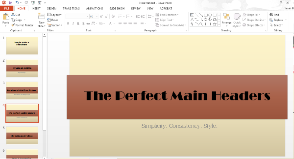
Use the “shapes” tool in the “Insert” tab to create backgrounds for your written content. The default color options that the color fill will give you will all be set to the color scheme you’ve already chosen, and you can play around with the different effects to get something that looks relatively professional.
I like to take this opportunity to add a brief description of the sub-section under the main header, as well as changing up the main header text so that it’s a little bit more interesting. In this case “Design your main headers” became “The Perfect Main Headers” with “Simplicity. Consistency. Style” written beneath it as a summary about what this section will deal with.
Need help with your content marketing? We're here to help.
 We've put together some awesome content that is sure to help you out, like an A-Z dictionary of online marketing terms, blogging templates that will help you get organized and guides to give you some tips along the way. We also send you marketing tips straight to your inbox. I know, it's awesome.
Fill in the Body of your Slides
Now for the good stuff – Filling in the actual content!
Pictures speak a thousand words, and with a Slideshare, you really need to utilize the power of images because you’re limited with how many words you use.
For example, in this slide I let the high-res, striking image tell its own story. I’ve literally used 6 words to explain what I mean in this slide, where I’ve used 70 words to do so in the subsection of this blog post.
Again, I’ve used shapes as a background for the text in order to allow the text to be easily readable for my audience. I also played around with the transparency setting so that it’s more seamless! It only takes a few minutes of playing with the formatting of the shapes to really get some nice effects going!
Using images as a background isn’t the only way to use them.
Images can be used anywhere in your slides: Right, left, centered… whatever you like!
However, one rookie mistake to avoid is to be too conservative with how and when you use your images. Make them big. Make them stand out. Make them centre stage. And last but not least, make sure they’re great quality.
If you have content that can’t help but be full of text, that’s fine. It has to happen sometimes, and as long as the majority of your slides aren’t all white background with a wall of text, people will forgive you.
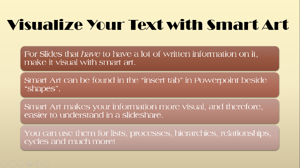
However, you can reduce how many of these text-filled slides you created by using smart art:
Create Your Intro & Conclusion
I like to leave this until the end because by then the feel and style of the slideshow has really come together and I have an in-depth understanding of what it’s going to be discussing.
I start off by vamping up the title slide:
I’ve just added the Slideshare logo to the back of the slide, and made the font larger and right aligned. Simple, yet effective!
I then create my intro.
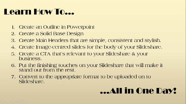
This is usually a summary of the headers, but I like to think of it as an itinerary of events!
The Finishing Touches
It’s the finishing touches to your Slideshare and the attention to detail that will really make it stand out from the crowd and really appear professional.
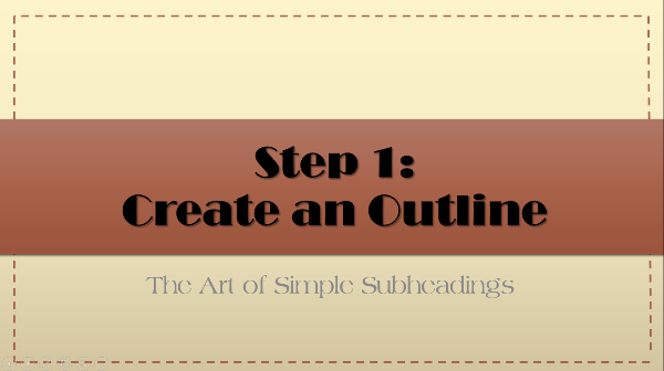
For example, I thought my main header slides could use a little more … something.
I added this simple border by going to “Shapes” in the “insert” tab and selecting the line shape. I then formatted it by going to “Shape Outline” and changing the thickness or “weight” of the line and selecting it to be dashed instead of solid.
Yet again, it’s simple, but incredibly effective!
Your Slideshare’s CTA
At the very end of your Slideshare, don’t forget to create a CTA. It can be something as simple as redirecting people to your blog where there’s more information, or inviting them to attend a webinar.
Whatever it may be, be sure to plug your own business only at the very end and that the CTA is relevant to the buying stage.
As you can see, the CTA that I created invites people to check out more inbound marketing tips over at Spokal. Because the topic of my Slideshare doesn’t even mention exactly what Spokal is, it would be premature of me to create a CTA that is further down the buying cycle. The chances are that people who are watching this particular Slideshare don’t even know what Spokal is, so my objective is to bring them to the site by offering them value.
You may also notice that the colors of my CTA aren’t in line with the color scheme of the rest of the Slideshare. That’s because you want to make the CTA branded specifically with your business’s stylization. It’s supposed to be separate and distinct from the rest of the slideshare, not blending into the background, making it easy to ignore (particularly at the end of a Slideshare!)
Export your Powerpoint to PDF
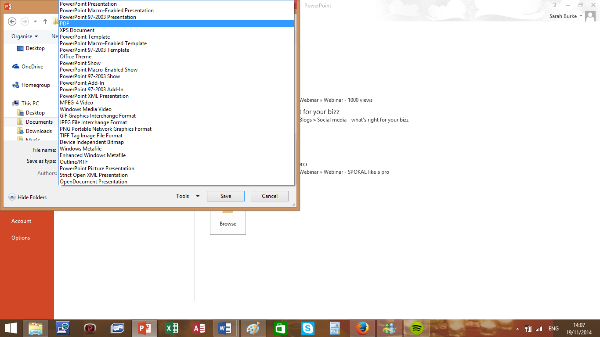
The final step is to export your powerpoint to a PDF format. If you have clickable links, then you can skip this step, however, it may change the look of your presentation. By exporting your presentation to a PDF it ensures that your presentation’s design and fonts will stay the same.
Simple go to Save As”, choose your location and then select PDF from the dropdown menu.
And voila!
You’re ready to rock!
Do you have any other tips when it comes to creating Slideshares? Please share!
Oh, and of course – Check out the Slideshare version of this blog post!
